Choose the right field type when setting up a questionnarie
When building questionnaries in the system, selecting the correct field type ensures you collect the right kind of data in the most user-friendly way. Below is a breakdown of each available field type, what it’s for, and best practices for using it.
Field type: Text
Description: A short free-text field, maximum 180 characters.
Use for: Names, titles, cities, or other brief responses.

How the "Text" field appears in the form

Field type: Email
Description: Validates that the input is a proper email address.
Use for: Collecting contact information.

How the "Email" field appears in the form

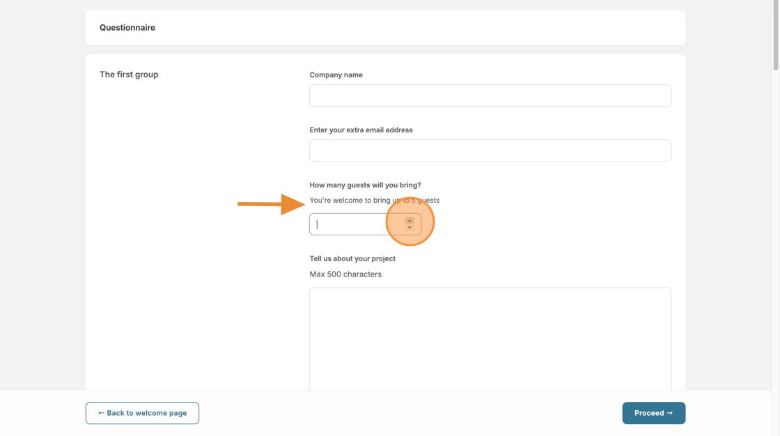
Field type: Number
Description: Only allows numerical input.
Use for: Quantity, age, zip codes, etc.

How the "Number" field appears in the form. They can either type the number directly or use the arrows to increase or decrease the value.
Field type: Textarea
Description: A larger field for longer text responses.
Use for: Descriptions, motivations, open-ended answers.

How the "Textarea" field appears in the form.

Field type: Phone
Description: Field for phone numbers.
Use for: Collecting mobile, work numbers or numbers to contact person.

How the "Phone" field appears in the form.

Field type: Select list
Description: A dropdown where only one option can be selected.
Use for: Long lists of predefined options. Good to use when you have more than 5 choices to keep the form clean and compact.

How the "Select list" field appears in the form.

Field type: Single choice
Description: Radio buttons where only one option can be selected.
Use for: Clear either/or selections. Ideal when you have 2–5 options and want all of them visible immediately.

How the "Single choice" field appears in the form.

Field type: Multi choice
Description: Checkboxes allowing multiple selections.
Use for: Interests, preferences, tags, dietary needs. Good to add "You may choose multiple" in the description.

How the "Multi choice" field appears in the form.

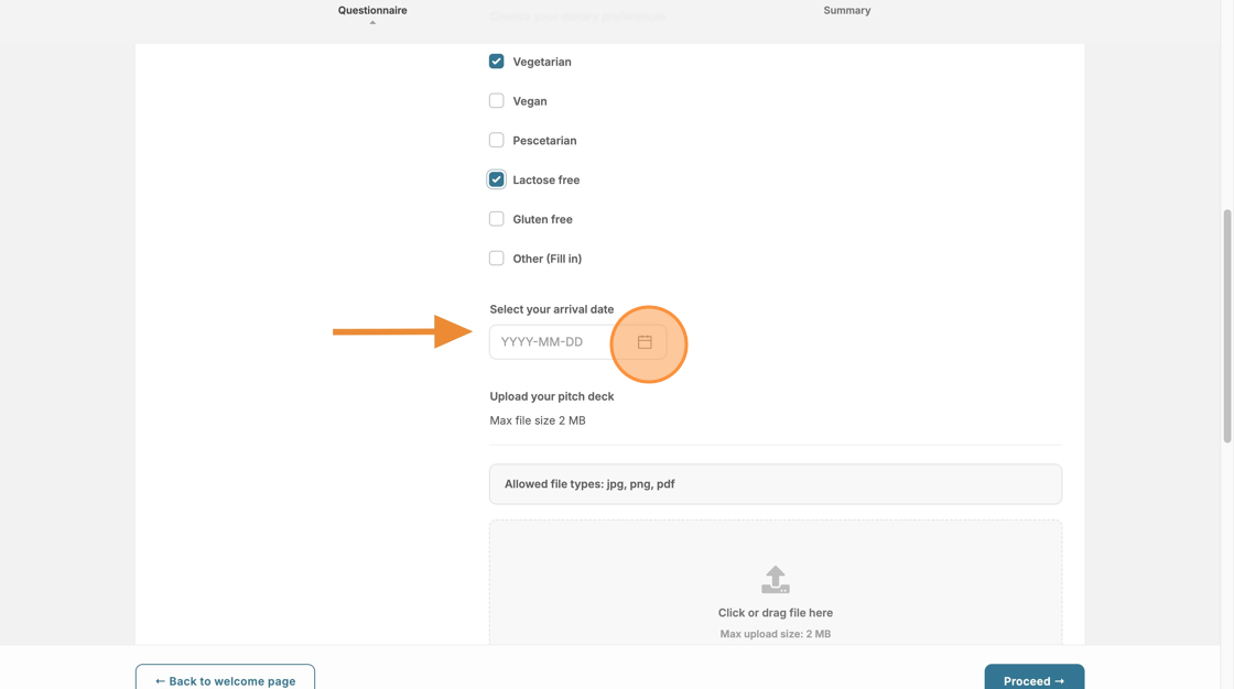
Field type: Date
Description: A date picker field.
Use for: Birthdates, bookings, deadlines, arrival date.

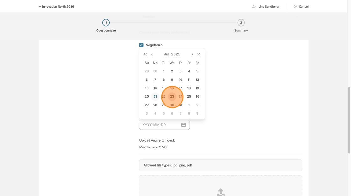
How the "Date" field appears in the form. By clicking the calender icon a calender will open.
It's then possible to choose a date from the calender.
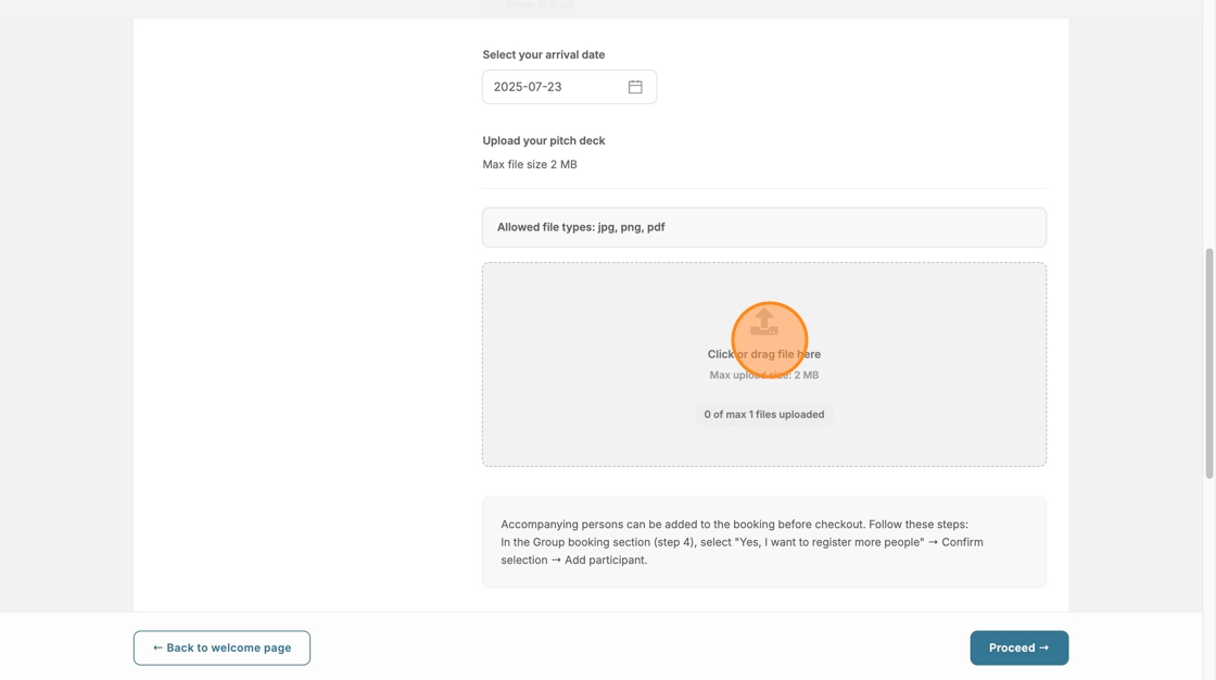
Field type: File
Description: Allows users to upload a file.
Use for: Submitting CVs, documents, presentations, student proofs.
In the setting you choose allowed file types: jpg, png, pdf. The maximum number of files and the maximum size.

How the "File" field appears in the form.

All the limitations will automatically be stated in the box where they will click to upload the file.
Field type: Information text
Description: Not an input field, instead it's used to display helpful text or instructions.
Use for: Section breaks, tips, extra context, information about the booking process.

How the "Information" field appears in the form.

Field type: Image
Description: Displays an image within the form.
Use for: Visual instructions, branding, or illustrations.

How the "Image" field appears in the form.

Field type: Video
Description: Embeds a video inside the form. Keep videos short (1–2 minutes) and position them at the top for visibility.
Use for: Introductions, explainer videos.

How the "Video" field appears in the form.

It's also possible to open up the video in fullscreen mode
